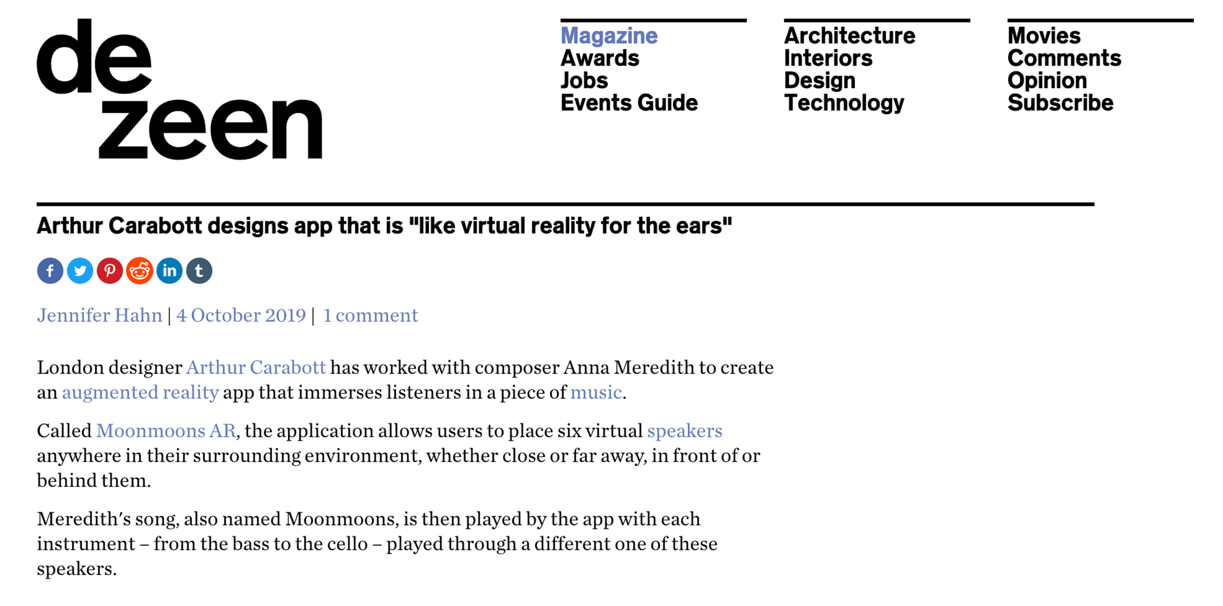
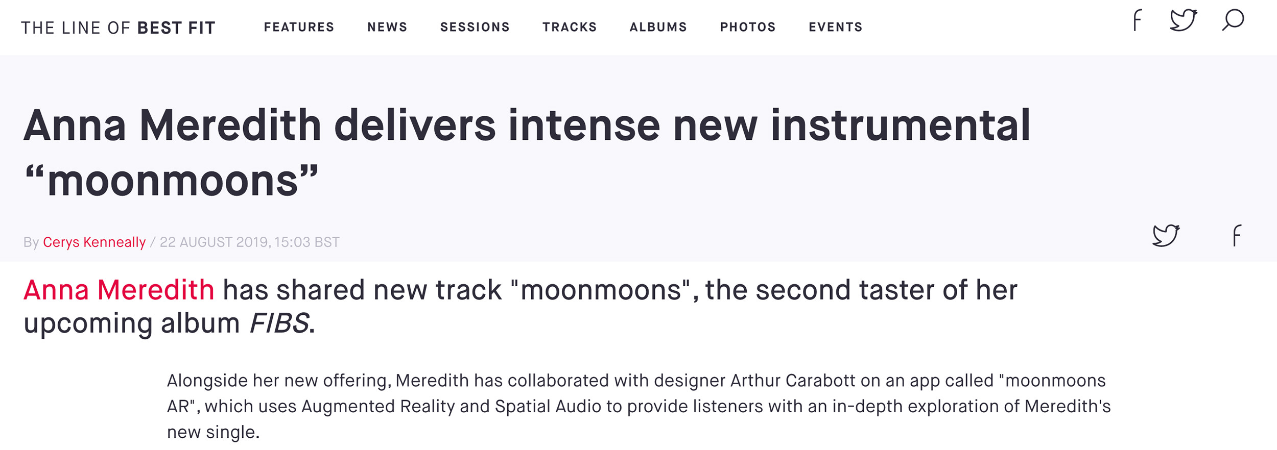
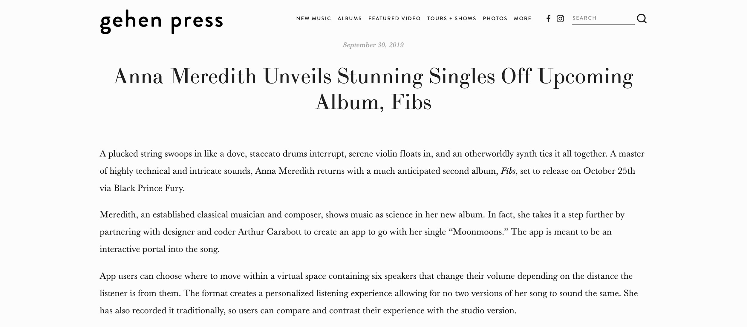
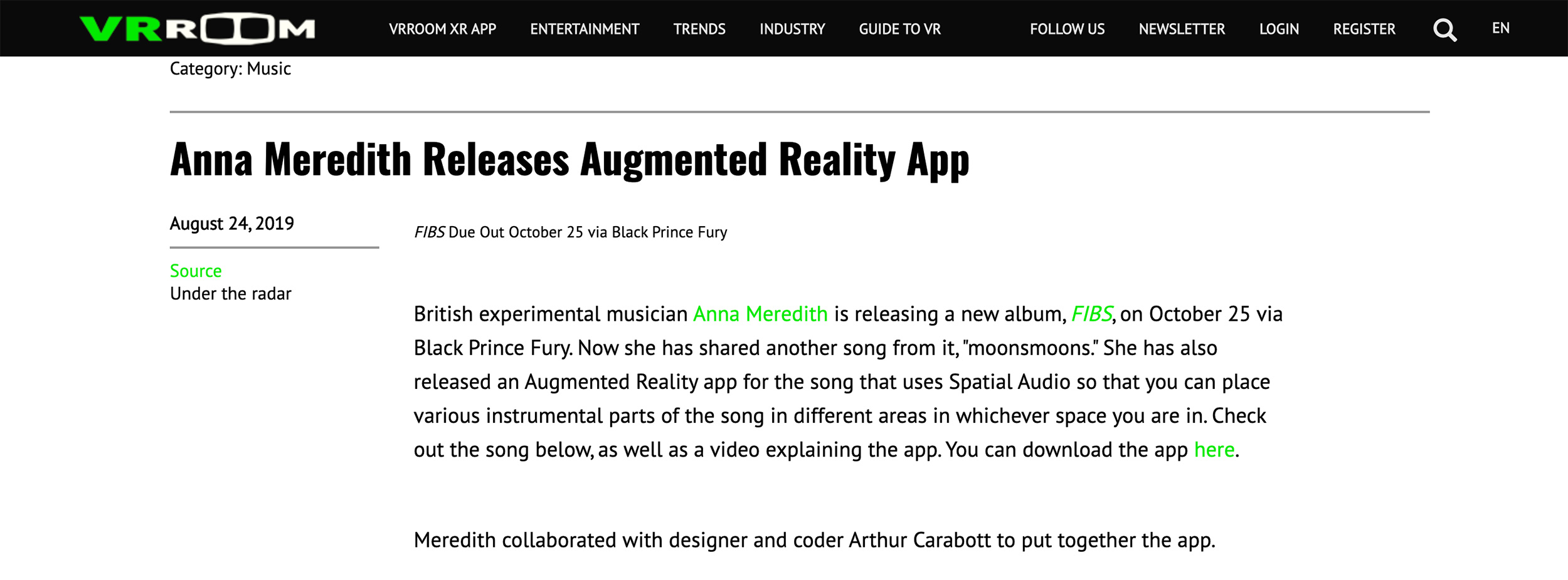
moonmoons AR
moonmoons AR is a collaboration with the wonderful composer, and fellow Somerset House basement dweller Anna Meredith: we took her piece “moonmoons” and turned into an Augmented Reality experience.
The app lets you listen to the piece as if the instruments were in the room with you. Each instrument is represented by a sound-emitting object that you can position; if you walk closer to an object it will sound louder, walk further away and it will be quieter, stand to the right of it and it will be louder in your left ear. It’s like having a surround sound speaker system in your phone!
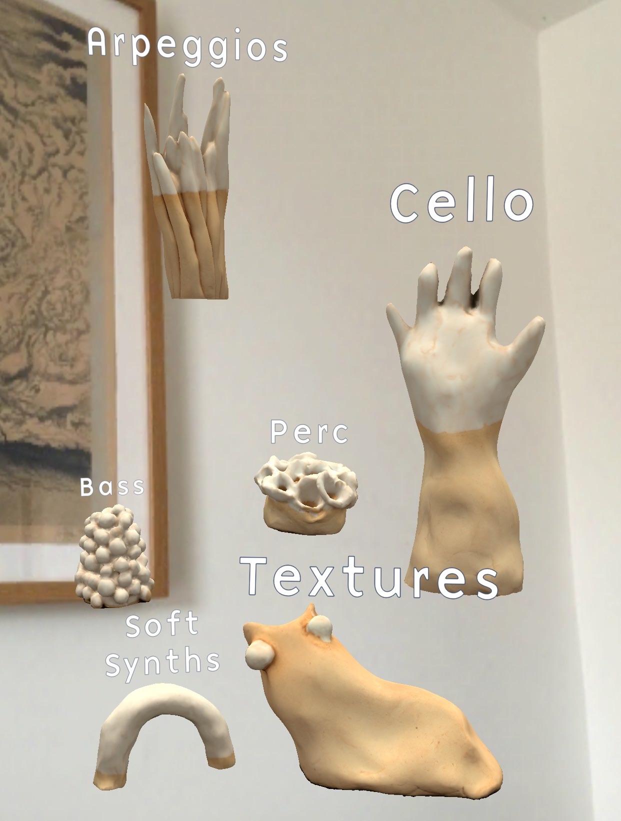
The instruments / objects
When the app first starts, the listener can decide where to place each of the instruments/objects, to create their own physical arrangement of the piece. This means they can place all the instruments close together and have a version that sounds similar to the stereo version on the album, or they can spread the instruments out so that it becomes possible to listen to the instruments in isolation simply by walking up to them.
Concept
This project was a realisation of an idea I had been thinking about for a few years: I had always really enjoyed getting my hands on the stems (the recordings of the individual instruments) of pieces of music; artists like Radiohead and Squarepusher have released stems for public remix competitions. While I had enjoyed loading these up in a DAW and listening to various combinations of instruments, this wasn’t something that the casual listener might be able to do easily.
A simple virtual mixing desk always seemed a little dry and underwhelming as an interface, and in a conversation with good friend Marek Bereza in late 2017 we realised that the new AR SDK in iOS would let you place virtual speakers in your room, that would stay where you put them, even as you moved around. In early 2018 we knocked up a quick prototype using the stems of Radiohead’s Reckoner, it was immediately clear that this was a much more exciting interface with which to explore the constituent parts of a piece of music.
Implementation
This is all made possible by the combination of Augmented Reality technologies like SLAM and Spatial Audio, and mobile devices becoming powerful enough to run them in real-time. The app itself was built with Unity, so that it could ship on both iOS and Android, as the ARFoundation plugin bridges the common features between iOS’s ARKit and Android’s ARCore. Unity was also useful as it provides a 3D editor environment, in which objects can be moved around in 3D and simulated on your development machine.
The development was actually quite painful, even for a relatively simple app. Any changes that need to be tested on device require a tediously long build process, and Unity’s ARKit Remote tool hadn’t been ported to work with ARFoundation. There are also some small things about the Unity development environment that slow things down enough to really prevent flow. The one that annoyed me the most was that any changes to the code wouldn’t be compiled until switching back to the Unity app, at which point it would freeze for a second or two before you can do anything.
Audio
Unity has a basic audio spatialisation engine, but a number of more sophisticated engines exist. I had originally wanted to use 3D Tune-In as the spatialisation is excellent, however I was short on time and ran into some integration issues. I ended up using Google’s Resonance Audio Unity plugin instead.
Originally I tried to make the audio experience as realistic as possible, with natural volume roll-off curves and even using Resonance’s room simulation to try and match the size of the listener’s room by expanding the virtual room size as they walked around their own space. However, I found that this didn’t create the best listening experience. The increased reflections and the natural roll-off curves means that instruments that were a few metres away were still very audible, making it harder to achieve the “instrument in isolation” experience that was so enjoyable, without having a huge space. Instead I manually tweaked volume roll-off curves, so create an experience that would more heavily attenuate instruments that were further away.
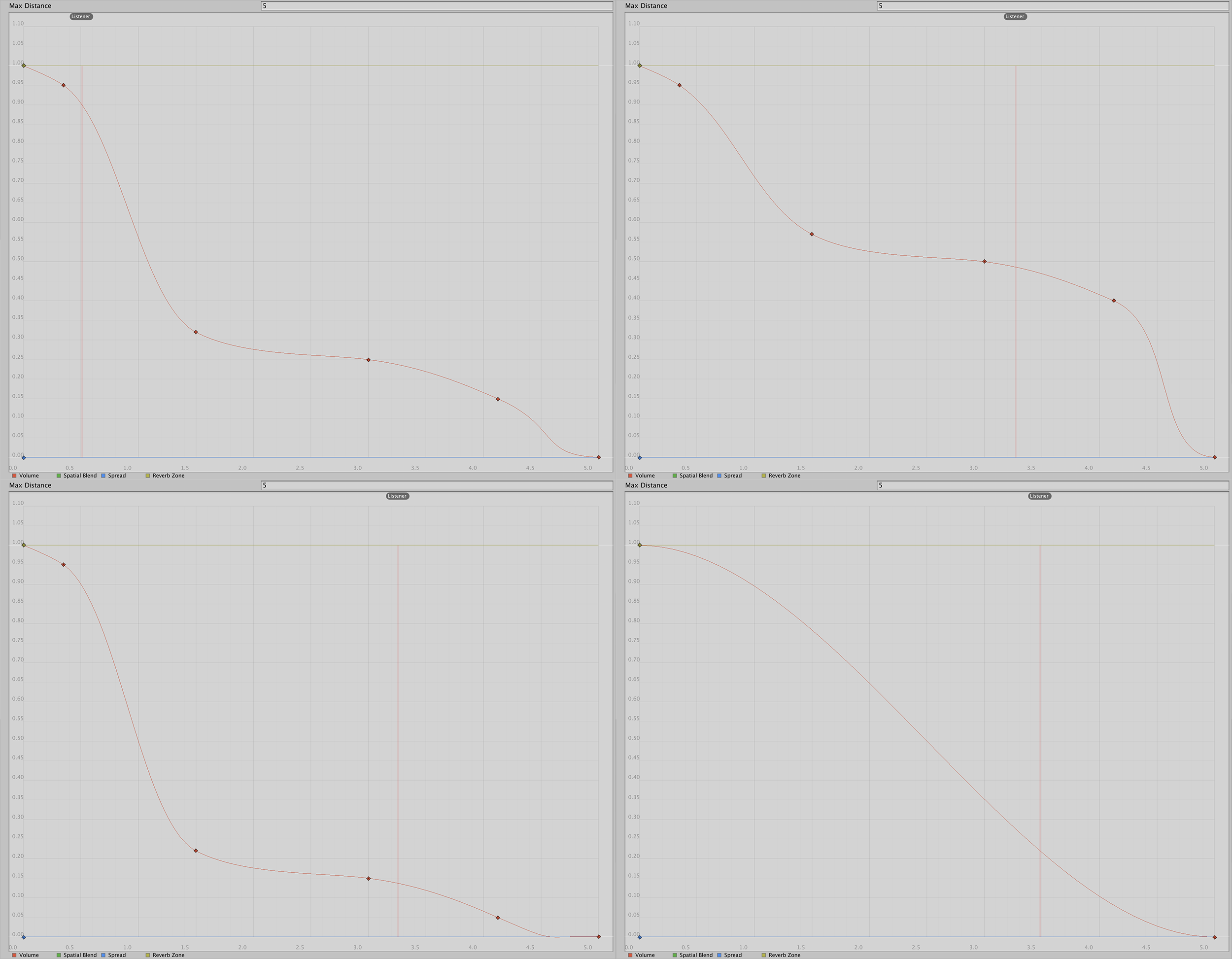
Volume roll-off curves, clockwise from top left: Common, Bass Drum, "Owls", Bass Arpeggios
I ended up using four different curves: most instruments used the same common curve, while the Bass Drum and Bass Arpeggios used variations on it to increase and decrease their ubiquity respectively. Finally the atmospheric “Owl” sounds had a gradual curve to make them into more of a background atmospheric part.
In addition to this I enabled Resonance’s “near field effect” for each audio source, so that there would be a volume boost when the listener was really close to an object.
Where’s your head at?
An important part of accurate spatial audio is having a good model of the position of the listener’s head (ideally also the size and shape of their head and ears). As this is a mobile app (i.e. not using a headset) you can’t know for sure where the listener’s head is, or which way it is facing. However, by having strong visual elements, I could estimate that they are looking directly at their phone and that it was a mid-stretched arm’s length in front of their head.
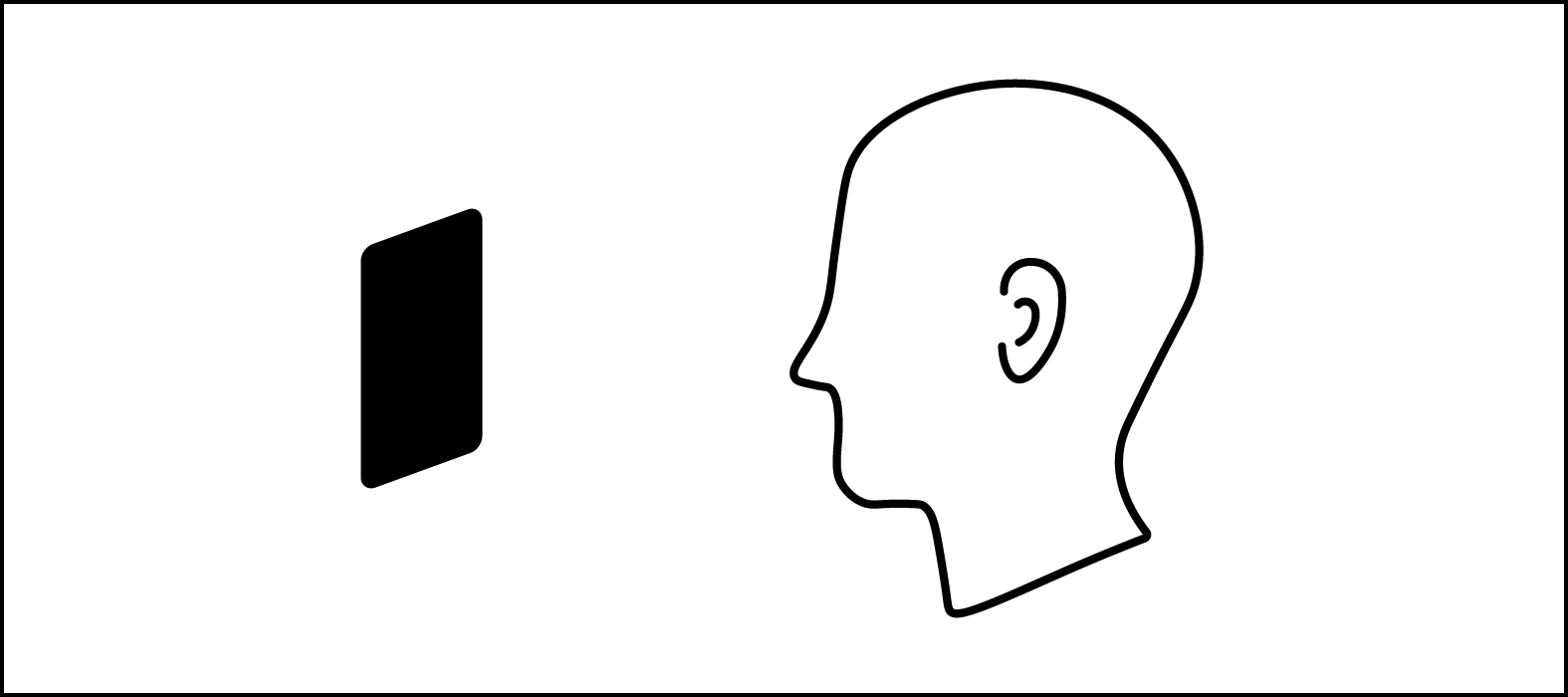
Estimating the head position based on the phone
In the original prototype with Marek we used this assumption to place the virtual head about 30cm behind the phone, which worked well, especially with our concept of walking inside the geometric objects (that would really boost the volume of that stem). However, with the much more interesting objects in moonmoons I found that people were much more likely to stand where they could see an object, rather than walk inside it. This means that they would never really “get up close” to a sound, and the effect of turning your head was greatly reduced. After some experimentation I ended up actually positioning the virtual head in front of the phone, more like a pair of ears on antennae! This gave the desired effect of the instrument being at it’s loudest when the listener stands in front of it, where they can see it. A really keen listener will be able to tell that it sounds unnatural when turning your head in the position, but for the most part it goes unnoticed.
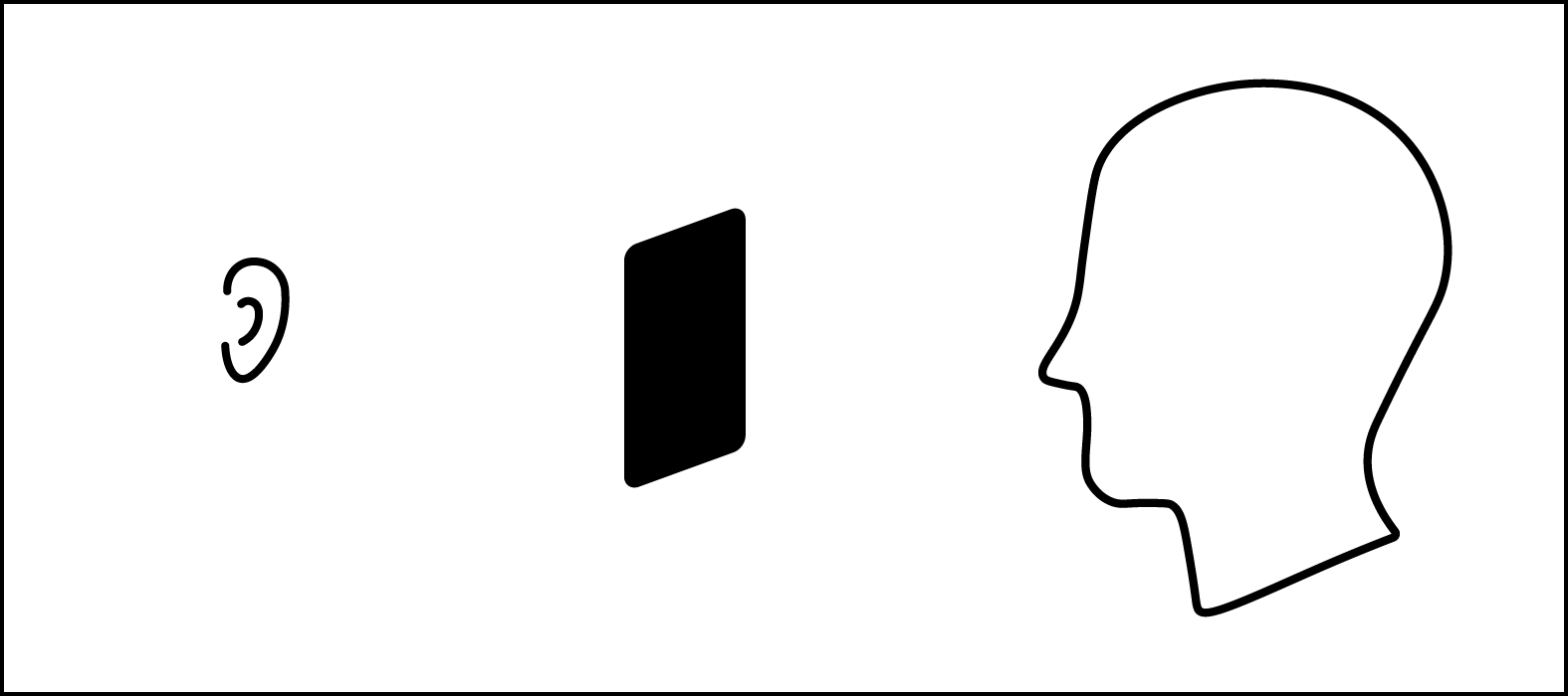
Placing the virtual ears in front of the phone
Ceramic Objects
The objects that represent each instrument were ceramics by the wonderful artist Eleanor Meredith (who is also Anna’s sister). Eleanor’s ceramics were used for album and singles artwork, so were perfect to represent the instruments within the app.

Single artwork

Album artwork
The objects were now so visually interesting (compared to the colouful abstract shapes used in the prototype) that it changed how listeners would interact with the app: rather than walking inside the objects to get the maximum “instrument experience”, they were more likely to look at them. This had the implications on audio previously mentioned. They did such a good job of situating the listener in the physical world of the album.
There were a lot of different objects to choose from, the final choice came down to consideration of how well they represented the instruments, variety, distinctiveness, and how easy they were to 3D scan.
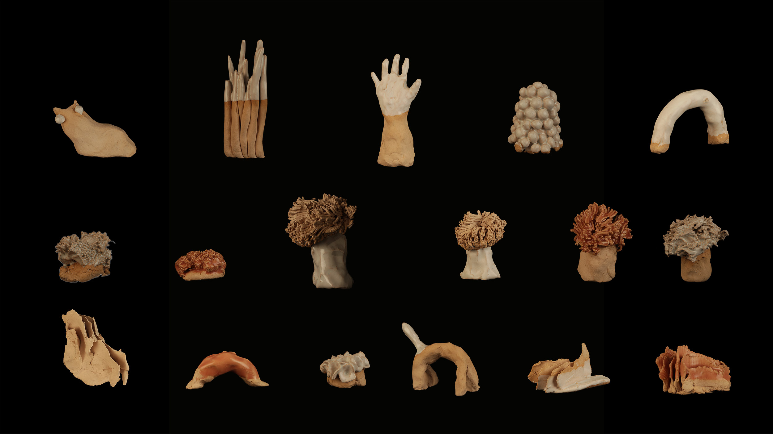
All the objects!
Photogrammetry
Having decided to use the ceramics, I had to face the daunting task of getting them into the app! I went through three stages of thinking: “This will be easy” (before trying to scan them), “This is going to be impossible, the whole project will be crap” (after first attempts at scanning), and finally “ok this actually looks feasible…” (after getting the first successful model).
I initially tried using some iOS apps and my iPhone 6S, but the results were unusable:
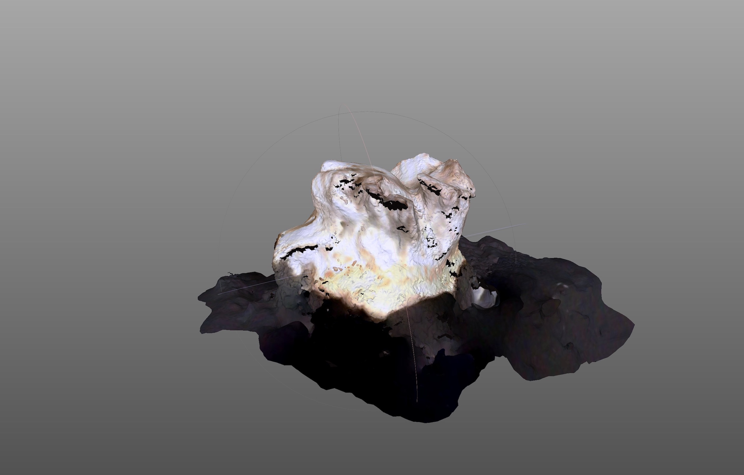
The first scanned ceramic
I realised that I was going to need some help, so reached out to Scott Eaton, another Somerset House resident, and an incredible sculptor that I had worked with on Asif Khan’s MegaFaces. Scott kindly invited me to a photogrammetry session he was doing with Sample & Hold to see if they could help.
In between full-body capture sessions they were doing with models in a crazy sphere of cameras and lights we talked about how to capture the ceramics (hiring them was beyond the £0 budget of the project). The ceramics were tricky to capture well because many had glazed portions that reflect light and throw the positioning computation off. They were also small, and many had crevices that would be hard to get shots of. Their quick tips were:
- Shoot RAW
- Try a black velvet background, matte, no texture or creases
- Use even, ambient lighting, no flash
- Use polarised light for reflective objects
- Put the objects on a turntable and do not move them when rotating
- 36 shots per rotation from the side
- 36 at an angle from the top
- Use a long lens from further away to get the whole object in focus (front to back). Prioritise this over getting the object to fill the frame.
- Could sit them on paper with dark speckle (e.g. black powder)
- Use RealityCapture software
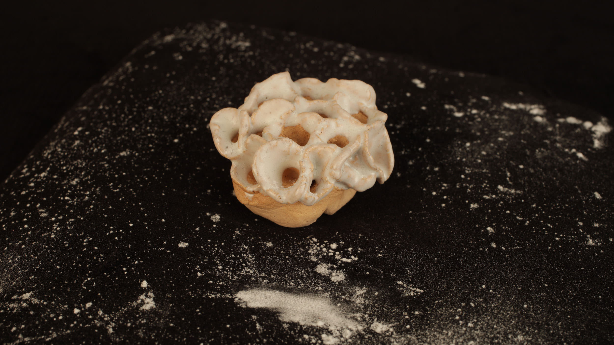
Using talcum powder to speckle the black velvet
Fortunately my dad is a photographer with a studio, so I wouldn’t need to rent any equipment. I found a roll of black velvet at local wholesalers Woolcrest Textiles and built a small rig with a velvet covered turntable. It wasn’t smooth sailing by a long stretch, there were a lot of difficulties, and some of the models weren’t usable at all. Fortunately I managed to get enough working models that we had a good selection of objects to choose from.
Problems
- Glossy glaze: the reflections were a huge problem, totally distorting the 3D model. I tried polarised light, but there were still spots of reflection that remained. I eventually solved this by using a few coats of a very gentle anti-reflection spray. It dulled the reflections, with only a very slightly noticeable transparent white layer. This looked fine on some of the red glazes, and eventually we ended up using only white glazed objects anyway.
- Camera position estimation: the more symmetrical models (like the Arpeggio) were very difficult for the camera position estimation algorithm. I ended up adding a speckle of talcum powder to the turntable velvet, to add more helpful estimation points. I also read that newspaper can work well too.
- Crevices: the Arpeggio object was also problematic because of the gaps between spikes. I ended up doing three full rotations at different angles: approximately 0º, 40º and 70º (where 0º is facing the object directly and 90º is a birds-eye view).
- Focus: having the objects in focus really helped the software, but was difficult with some of the longer objects. However, I had objects fail a lot when shooting from too far away. In some cases I did close up and far away rotations.
- Software / Hardware: unfortunately RealityCapture only runs on Windows with Nvidia hardware. With only a MacBook Pro (AMD GPU), and no easy access to a powerful Windows machine, I felt a bit stuck. Fortunately I found Metashape which runs really well on macOS. One of RealityCapture’s big selling points is that it runs 10 times faster (apparently) than the competition. After shooting the first model, I processed the RAW images and it took over 15 hours! With it taking up all my computing resources, this would have made development impossibly slow. This meant I switched to using the jpegs, which significantly sped up the process (down to about 45 minutes), which may have impacted the quality of models.
- More camera position estimation problems: In some cases Metashape would get really confused. I eventually gained an intuition for batches of images that would be easy to resolve, and would get it to process them 5-10 at a time (rather than all ~100). The previously resolved images seemed to help resolve some of the more difficult ones.
- Messy models: some of the models still had messy lumps or chunks missing. Metashape has some nice tools for cropping models and filling holes (the selection tool in particular has a nice interaction model). Doing this iteratively eventually helped me get all the models to a much cleaner place. A really nice workflow I found was to use my iPad with Duet to mirror my monitor, then using the Apple Pencil for selecting the polygons to remove.
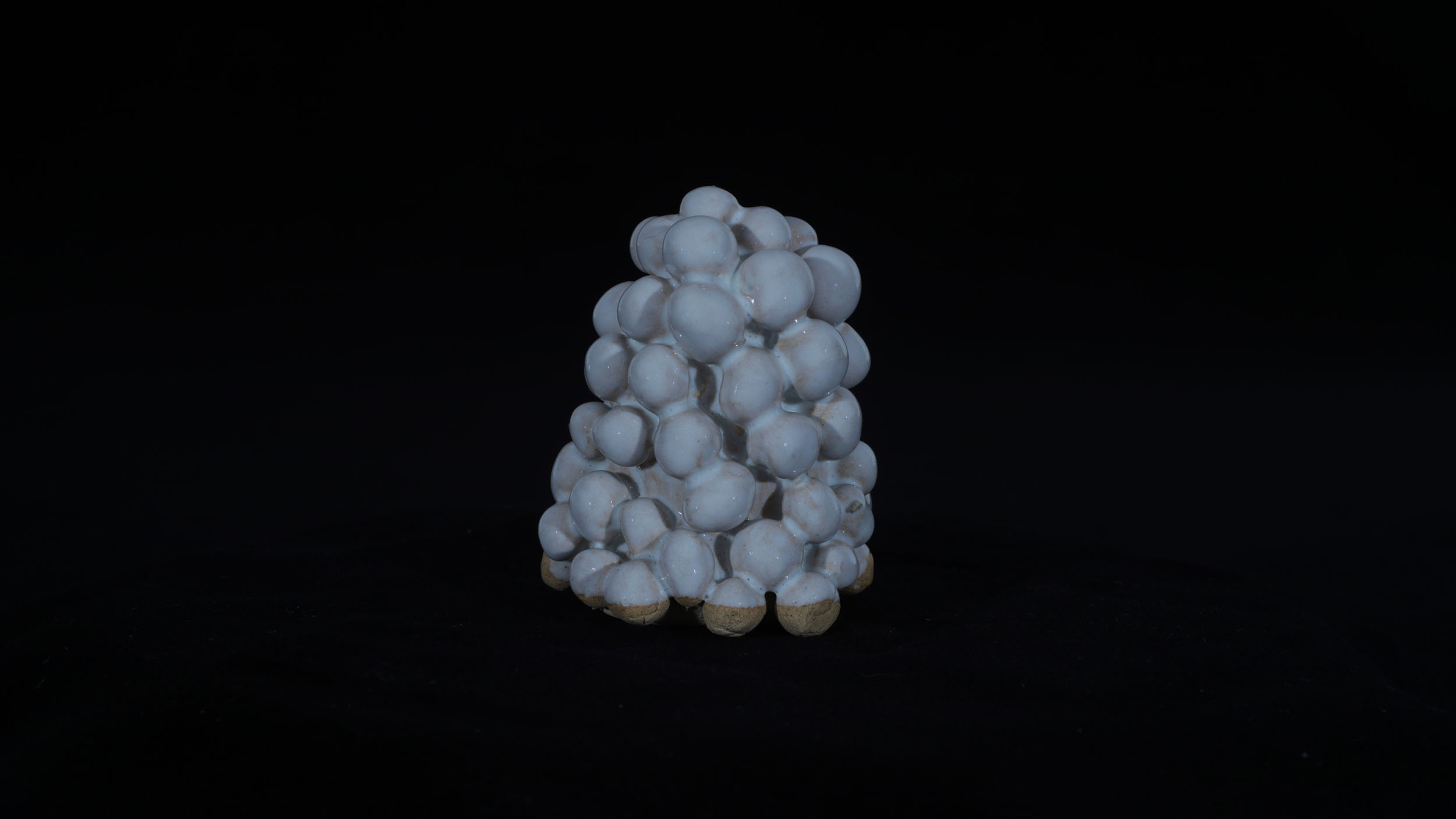
Shooting with polarised light to reduce reflections
In order for mobile devices to be able to handle all the models, I experimented with Metashape’s polygon reduction tools to reduce them from 0.5 - 2 million polygons down to 5000. I also did some post-processing of the textures in Photoshop, as they were fairly dark; a result of the lighting used when shooting, which had to avoid casting shadows as much as possible. I also discovered that you can load .obj files in Photoshop and modify or paint over the texture on the 3D model. This is really cool, but had one annoying interaction: making a selection would also select any polygons behind it, e.g. if you select part of the top face of a cube, you’ll also select some of the bottom face. This is something that Metashape’s selection tool got really right: selections are only made on the visible surface.
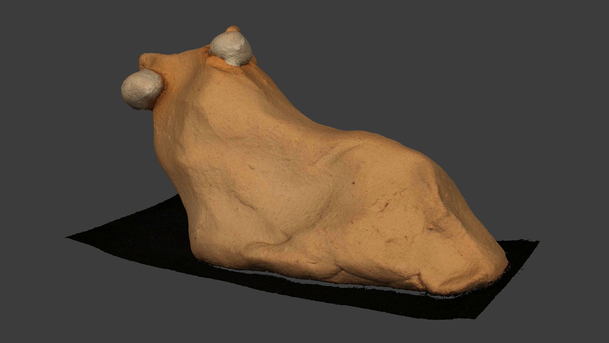
Millions of points
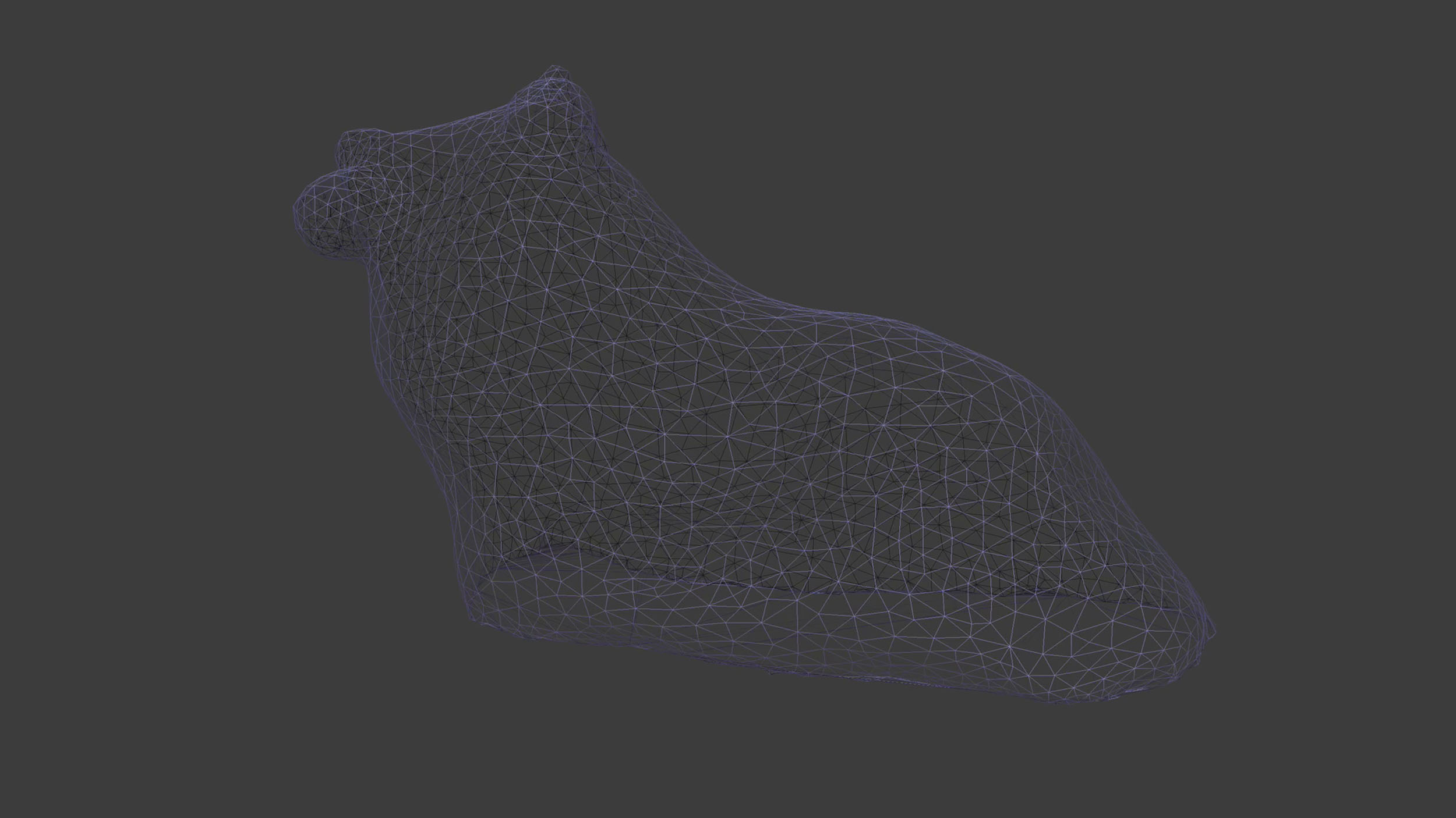
Wireframe: cleaned up and with reduced polygon count
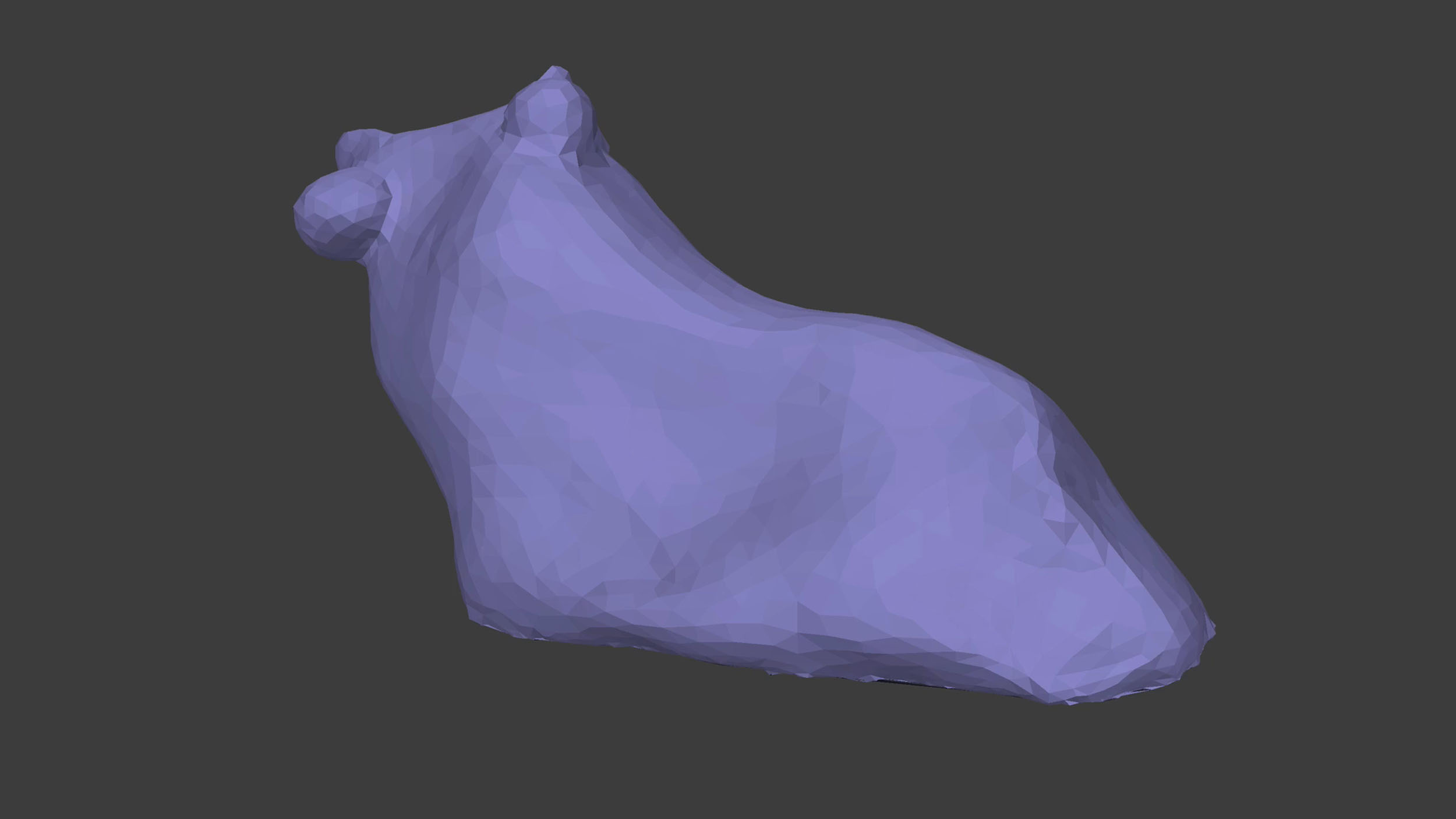
Polygons with surface
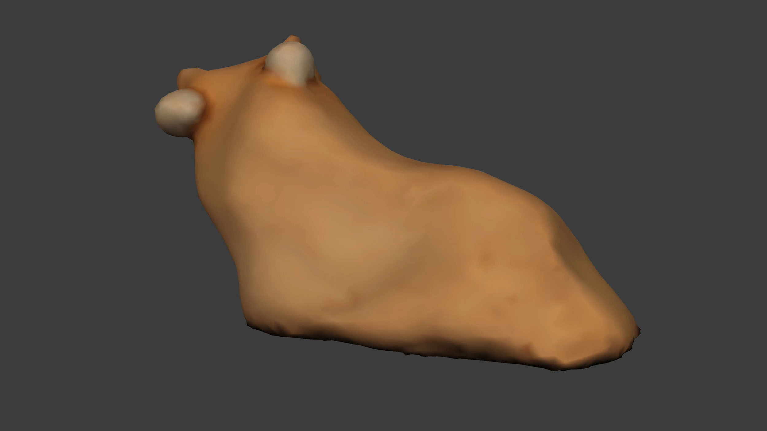
Surfaces with colour
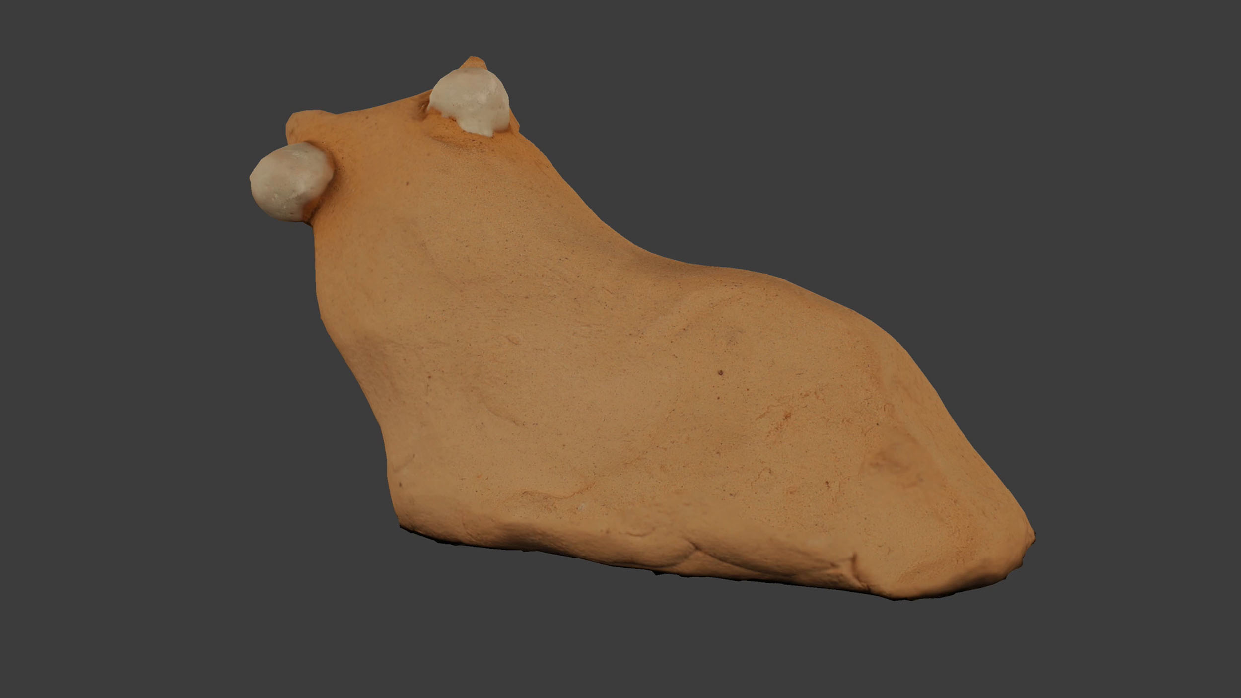
With image texture
Press
