How to Change a Number
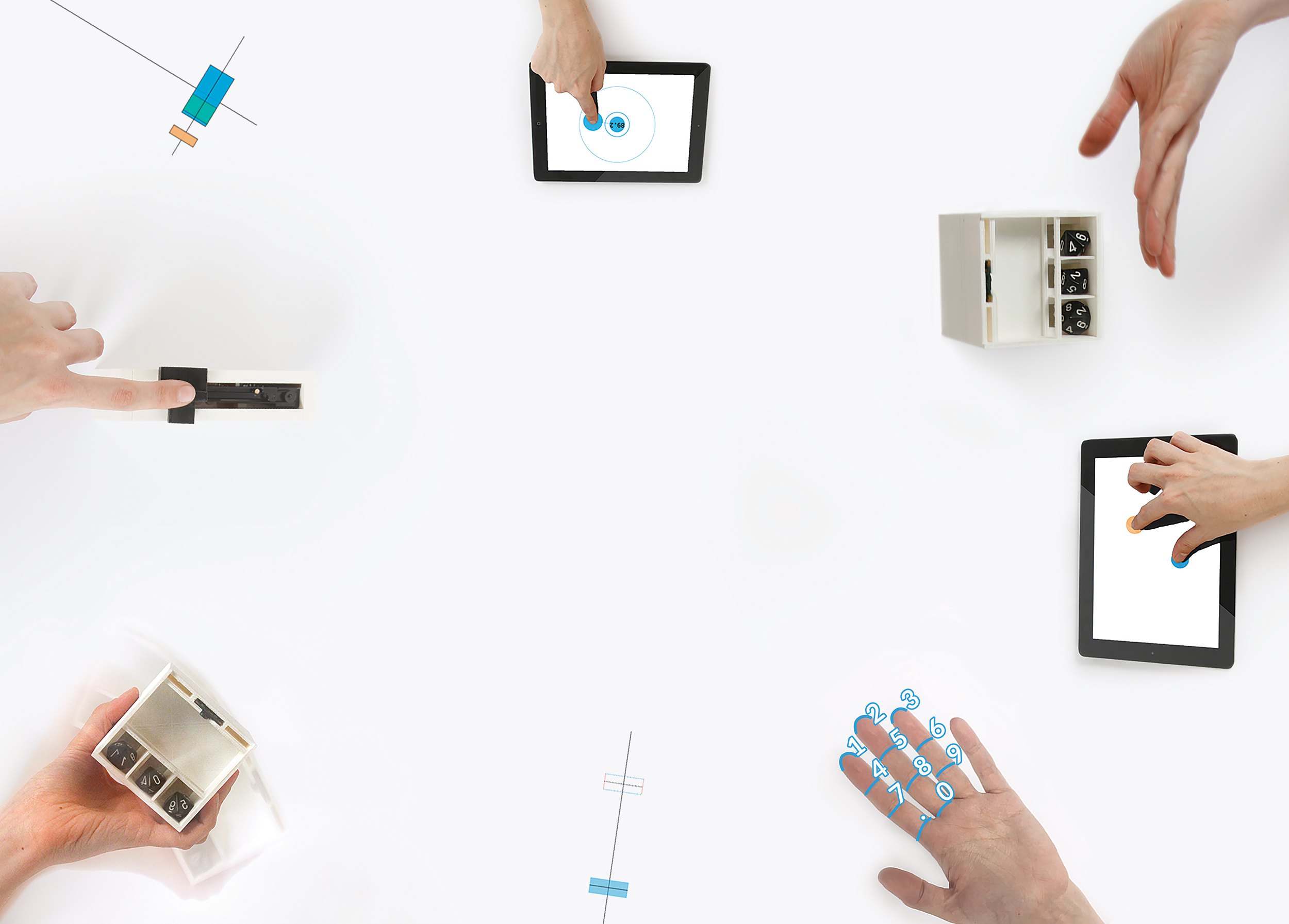
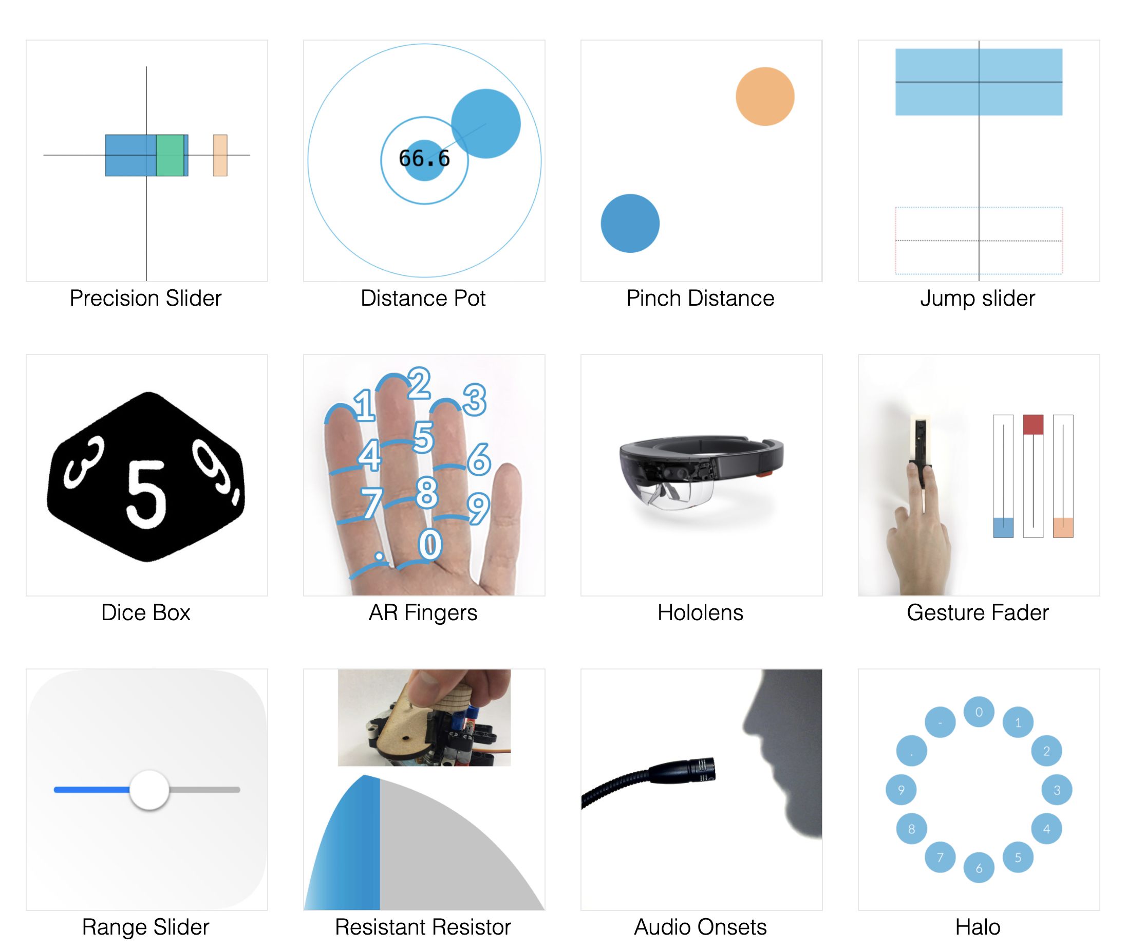
This project is an exploration of a single, basic, interaction design concept across a wide range of technologies and media. The concept is the many reasons and methods we have for changing numbers.
Table of Contents
- Background
- Just show me the projects
- Why?
- Why? (post-rationalised)
- Families of number intentions
- RCA Show
- Projects
- Press
Background
The project began with fifty concepts for ways to change a number (the original title was “Fifty Ways to Change a Number”, after the Paul Simon song), of which sixteen were developed into prototypes. The range of media included screen based interfaces, hardware augmented by machine learning and haptics, audio controlled interactions, and augmented reality.
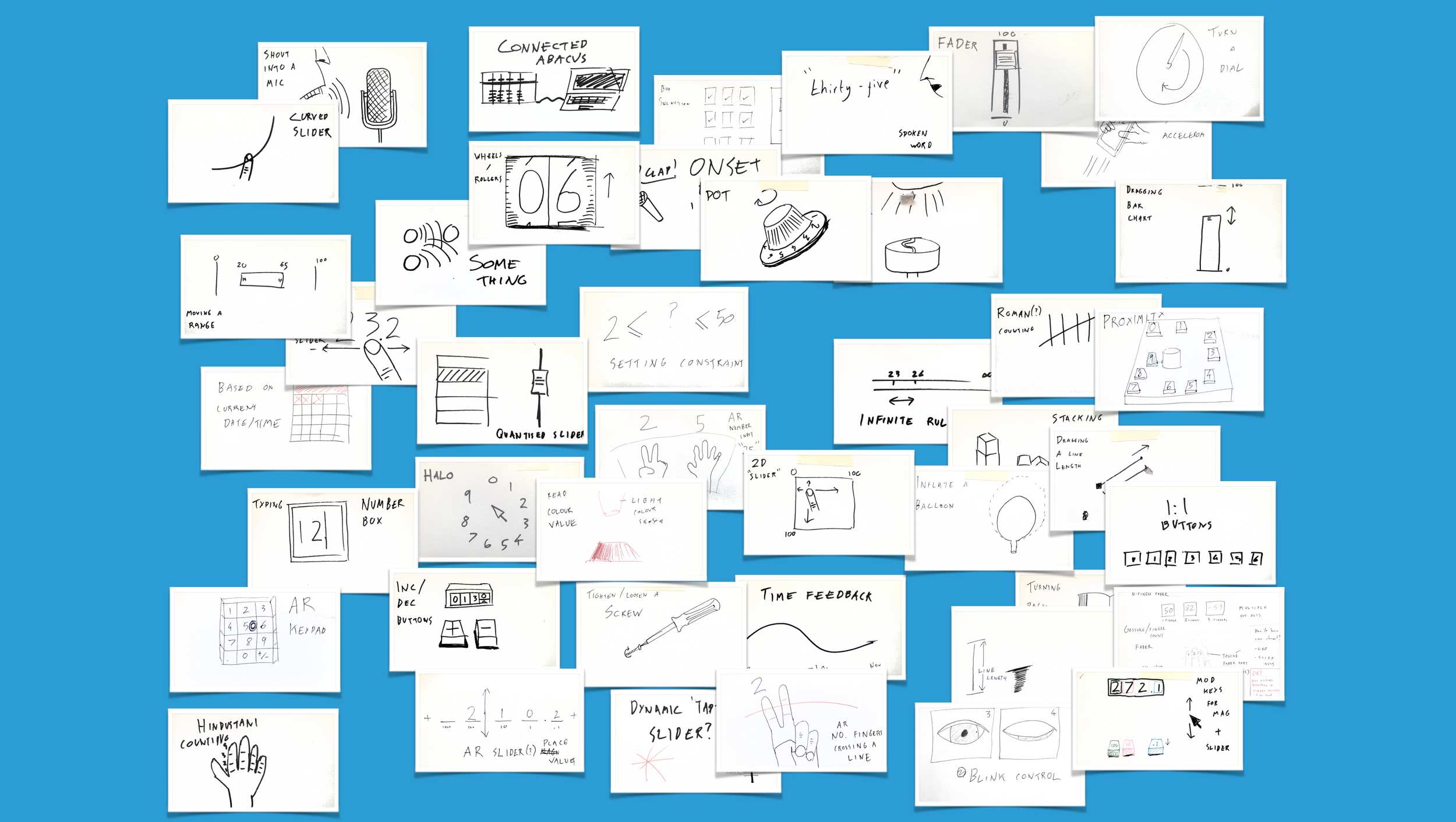
Original 50 concepts
While the range of purposes for number-based interfaces is vast (everything from medical equipment to music production, from aircraft controls to video games) the intentions are often similar. For example, “I want to get to an approximate number quickly” or “I want to input a precise number, with no margin for error”. This is true even if the person acting isn’t even thinking in terms of numbers, selecting an option from a list can be modelled by the selection of an index.
The interesting thing about developing new interfaces is the task of balancing nature and nurture. There are physical limits to the precision, size and speed of our hands that will determine what will and will not work. We also build up a ‘vocabulary’ of interactions (e.g. sliders, double-click, pinch-to-zoom), that determine what feels familiar or unfamiliar. These are easily mistaken for what does or does not work, or what is “good” or “bad”.
Just show me the projects
Why?
This project was done in the last few months of my Master’s at the Royal College of Art and Imperial College London. My previous project (Musician’s Mirror) had been a large, singularly focused ‘product’ type project. I wanted this project to be different, so I took an inverse approach. Rather than finding a problem, then looking for the design and technology to solve it, I thought about how I wanted to spend my remaining time and designed a project around that. My basic criteria were:
- Go through the entire design process multiple times, from concept to rough prototype, to presentable work.
- Use a range of technologies.
- Have a mix of physical and digital prototypes.
- Make the exploration into the outcome.
- Explore new interactions (they had to work, but placing value in novelty and exploration was an emphasis).
The result was what I referred to as a “Design Study”, in the way that an artist will do a study of a particular aspect of their work, or a musician works on scales or études.
I chose the interaction of ‘inputting/changing a number’ because it is so basic and fundamental to how we interact with computers. People end up ‘changing numbers’ a huge number of times per day, regardless of whether they are musicians, architects, programmers, or doctors, and regardless of what they are actually doing is changing a number, as so many interactions can be abstracted and represented as ‘changing a number’.
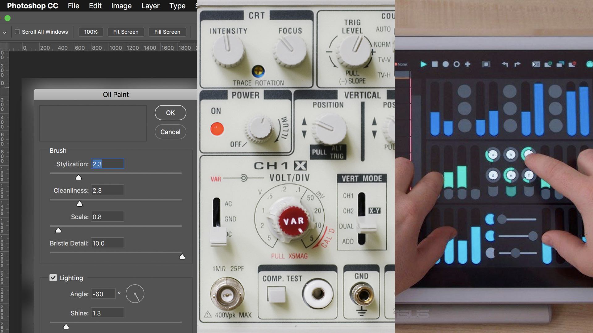
Number Interfaces in the wild
I feel strongly that it is a good idea to work on and revisit the basics of your craft. There are depths to them that only appear as you become more experienced. They can be microcosms of bigger projects, with scaled down versions of the problems you will face in larger scale work. In music, many of the fingerings encountered in pieces of music will appear in scales and arpeggios. In programming, there are design patterns that crop up in all types of projects. In design, learning to do very focused prototyping is useful when finding the form of a small product and when trying to design a complex system. When working on more complex interaction designs such as those in installations or professional software the complexity and number of variables can make it difficult to carve up the problem and get a clear understanding of the problem and solution. Focusing on such a small interaction provides a playground where focusing on the details is possible, and lessons can be learnt that will scale to other projects.
I wanted to do a project that was analogous to practising a lot of études.
Why? (post-rationalised)
While explaining the project to people for eight hours a day during the graduation show, a narrative emerged that made me realise some of my motivations and design approaches. The project became an embodiment of my critique of how we often design when new paradigms appear, it became an exploration into how we can actively go against this pattern.
I spend a lot of time thinking about why things that are “better” often take a long time to catch on, or fail to entirely (I wrote my Master’s Dissertation about this in Computing and Musical Interfaces). I believe that one of the reasons is a common design pattern when new technology is available: the copying of designs from the old medium to the new. This happens in everything from physical materials to software, although some fields are worse than others.
“It is most unfortunate, indeed, that manufacturers fail to take full advantage of plastic materials in creating new designs. There is too strong a tendency to imitate the materials used previously or at least to imitate their form and design. It should be realized that with new materials which can be so cleverly molded and machined, new forms are not only possible but are to be desired, and we must try to discover these new applications.”
– Marcy Babbitt, “As a Woman Sees Design: An Interview with Belle Kogan”, 1935
This has many reasons, and critics will be met with many defences. From my own work in new interfaces for music software, the most common defence is that the familiarity of skeuomorphism makes it easier for those familiar with hardware to use the software (never mind that the growing majority people who use the software have never seen the hardware in the first place). Certainly it’s true that the Alan Kay’s Desktop Metaphor was a beneficial paradigm shift in computing that dramatically broadened the approachability and power of the computer by tapping into the user’s understanding of the physical world.
In other cases the possibilities and techniques of the new media are unknown in its infancy. This can be true both of physical materials and of software, just compare the graphics of early and late games on any console.
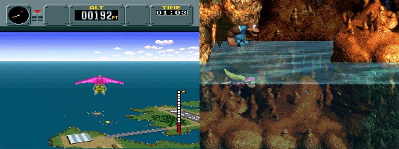
Two Super Nintendo Games: Pilot Wings (left) was a launch title, Donkey Kong Country 3 (right) was one of the last games created for the console.
The concept of taking advantage of the inherent properties of your material, and not forcing it to be something it is not, is known as Material Honesty and has been discussed for decades.
Modern design should express the qualities and beauties of the materials used, never making the materials seem to be what they are not.
– Edgar Kaufmann, Jr., What is Modern Design? 1950
I strongly believe the same is true of software interaction design, we should take advantage of the dynamic nature, speed and storage of the computer. One of the serious drawbacks of skeuomorphic design is the prolonging of the old paradigm, which can stifle progress. Software that replicates the recording studio or darkroom is cheaper and more compact, so it’s no surprise that it feels like an improvement. The lack of qualitative improvement is a hidden cost.
Skeumorphism is often talked about in only in terms of appearance, e.g. Apple’s Notes app looking like yellow paper, or address book being “leather bound” until they moved to a “flat” design with iOS 7. This is not my primary concern, I am more concerned with skeumorphic design of the product as a whole: the way things are designed to be used getting stuck in the past.
On a more positive note, great things can be done when the new media is embraced, and its properties exploited. This was part of what made the Eames’ Plastic Chairs (originally fibreglass and resin) such a successful design. It is what Alan Moore and Dave Gibbons did when they included pages from a fictional book in Watchmen. This is how Eisenstein and Murnau broke away from “theatre on film” and started to define the medium of cinema with techniques like montage and the unchained camera.

Eames Plastic Chairs
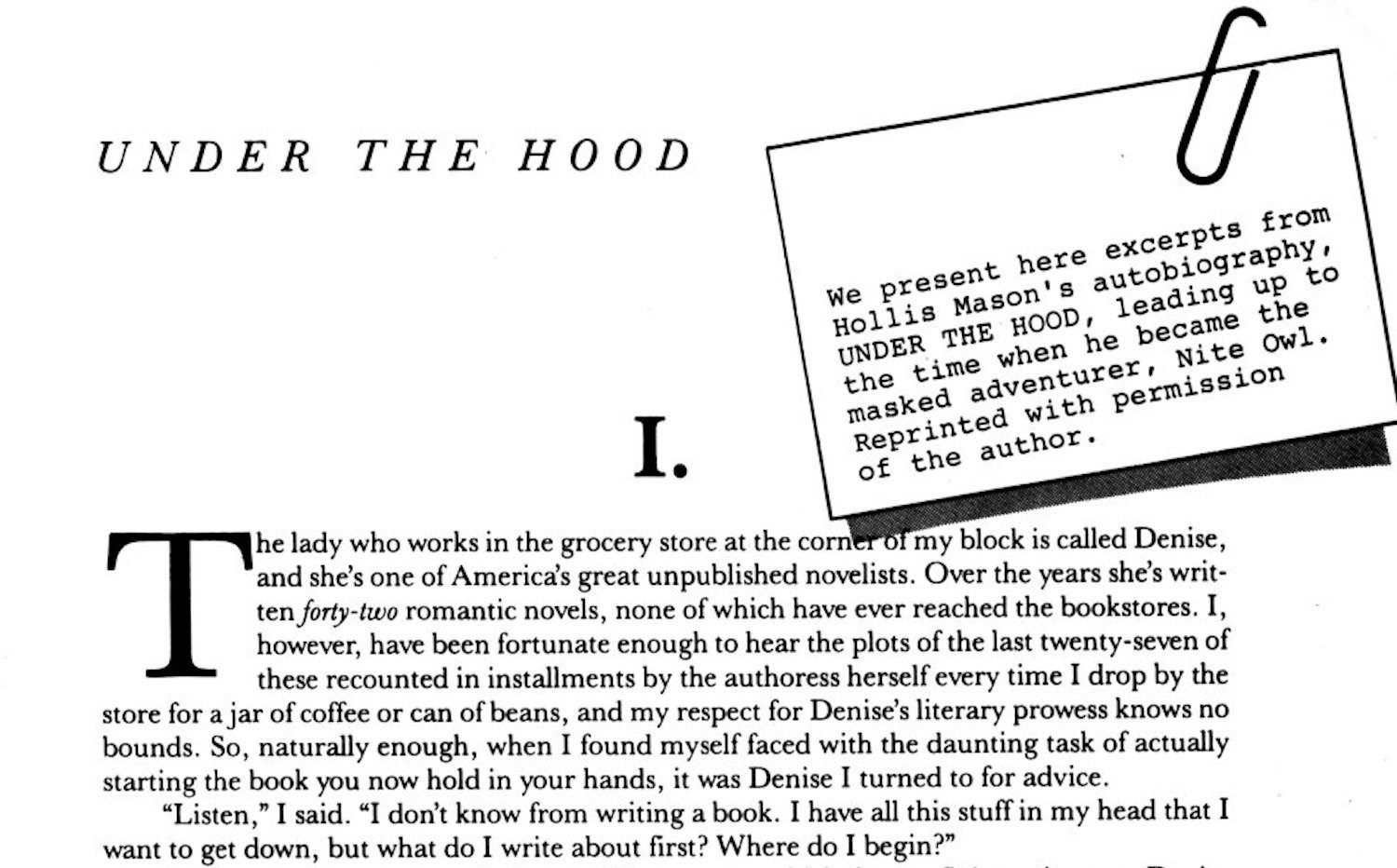
A page from Under The Hood within Watchmen
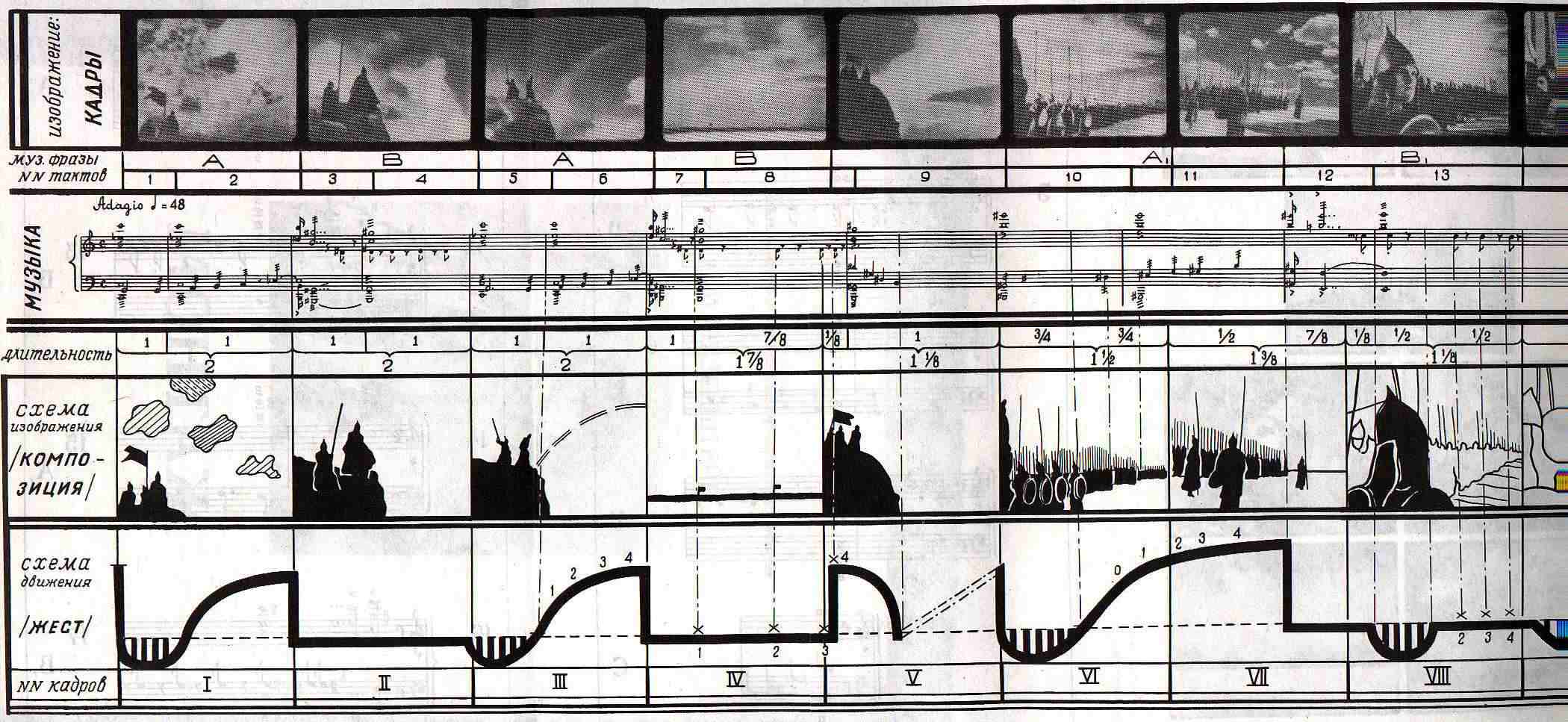
An Eisenstein Montage
Families of number intentions
Something that emerged from thinking about and prototyping number interfaces non-stop for months was a growing sense for the different familes of number interfaces. After thinking about it more, they felt less like categories of interfaces, but of intentions.
I started putting together a taxonomy of them and came to these five abstract types:
- Precise
- Imprecise
- Counting
- Choice
- Unexpected
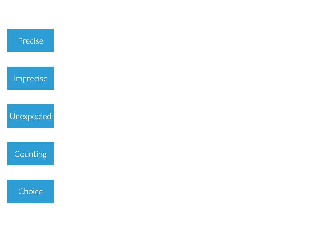
Five abstract types of number interaction.
Precise
You’re trying to to hit an exact number, you probably already have the number in mind, e.g. a telephone number or date of birth. A keypad is example of an interface designed for this purpose.
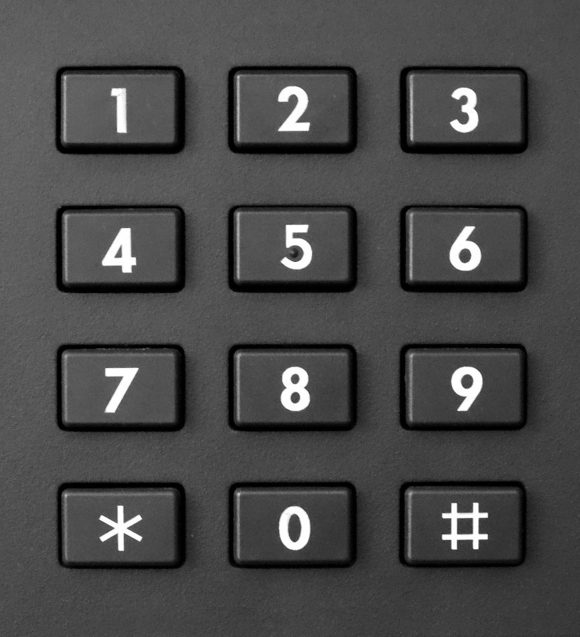
A telephone keypad
Imprecise
The number you’re after isn’t actually that important in itself, what matters is what it represents, e.g. RGB colour values. Sliders are commonly used for this need.

A touchscreen slider
Counting (Increment / Decrement)
The basic case is of keeping track of a the number of times an event occurs. This might increase or decrease, and may move in steps greater or less than one.

A tally counter
Choice
Deciding between a set of numbers. This type of interaction isn’t limited to numbers (it could be a choice of fruit), so more precisely it is the choice of an index.

A dropdown menu
Unexpected
Providing a number that you didn’t expect, e.g. dice, or Math.random() for the JavaScript folks.
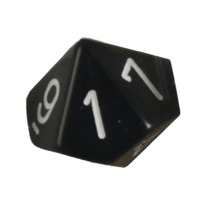
A 10-sided die
At the highest level of abstraction I think that interfaces serve one or more of three purposes:
1. Communicate an idea
2. Find new ideas
3. Modify an idea
In practice they are often used as a mixture of these.
More on this
This type of interface is the most significantly different from the others, which take on the first potential role of an interface, while this takes on the second.
At the highest level of abstraction I think that interfaces serve one or more of three purposes:
1. Communicate an idea
2. Find new ideas
3. Modify an idea
In practice they are often used as a mixture of these.
More on this
Further definition
I started looking for the properties that defined these intentions. Why were these tools needed, and what were their essential properties.
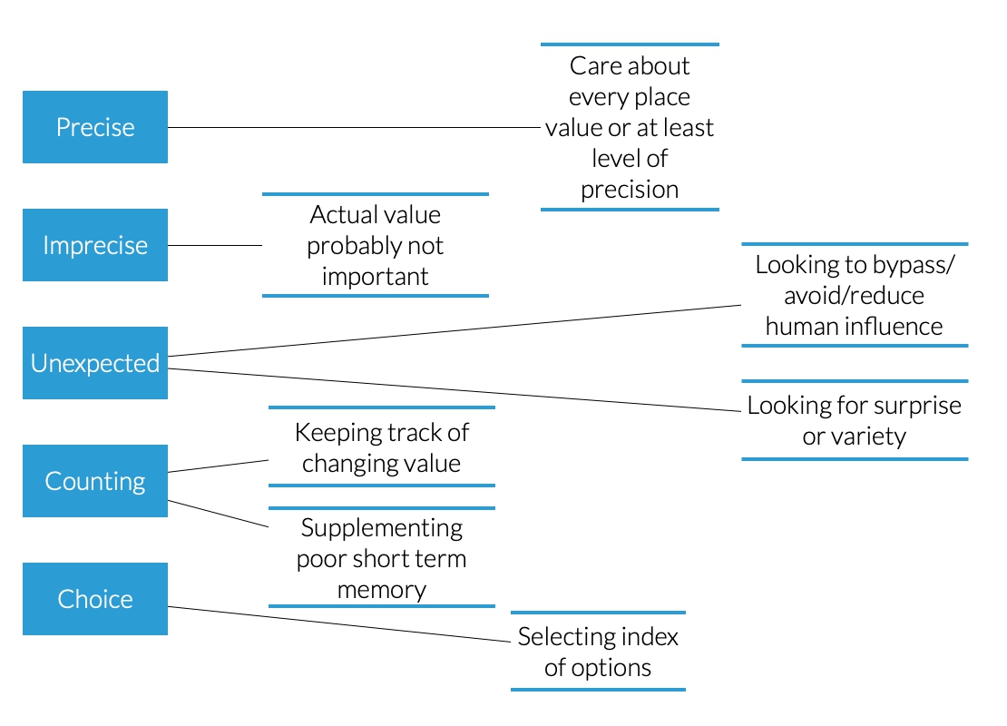
Adding definitions to the abstract types.
Additional properties
There were a number of other characteristics that felt important to these intentions, but were not categories in and of themselves. Instead they were more like features that could be combined with the base types to create more concrete requirements.
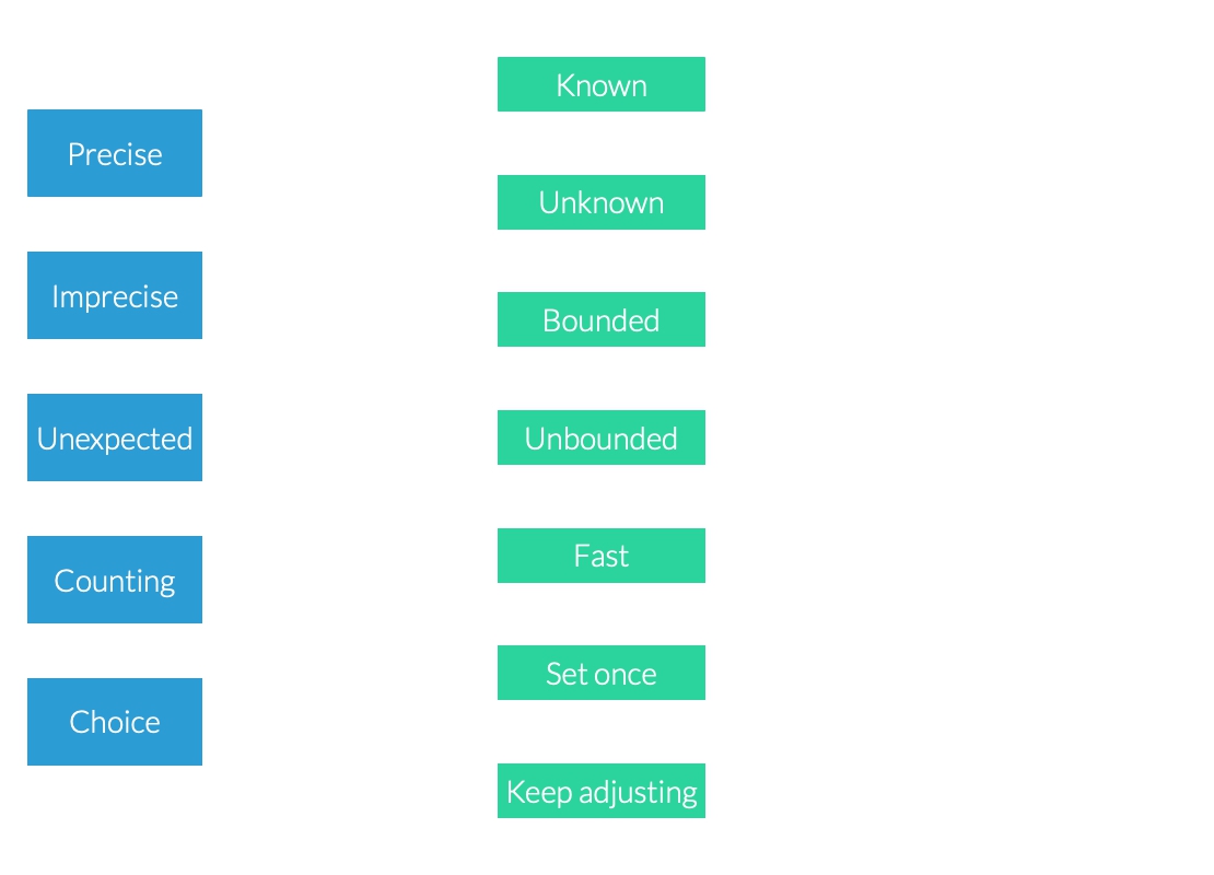
Properties of interaction types.
For example, it may be desirable for an interface to provide a bounded or unbounded range of numbers. A bounded range of numbers is useful when only a certain range makes sense (e.g. you can’t have a negative age, or go to 125% of the way through a book), or when any value outside of a range would be dangerous.
Another important factor is whether the number is known to the user before hand or not. In the case of storing a phone number it will be, but setting the volume of an amplifier might not be, and requires feedback. If the number is known, the ability to make quick adjustments isn’t a priority consideration, whereas for unknown numbers it is extremely important.
These too had their own set of important properties and considerations for turning into concrete interfaces.
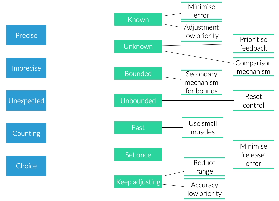
Properties of properties.
Variations
It was also clear that many of the intentions and conditions had variations. e.g. counting might happen in single units, or a particular step size, or a bounded range could have stop the user at their minimum and maximum limits, or wrap around.
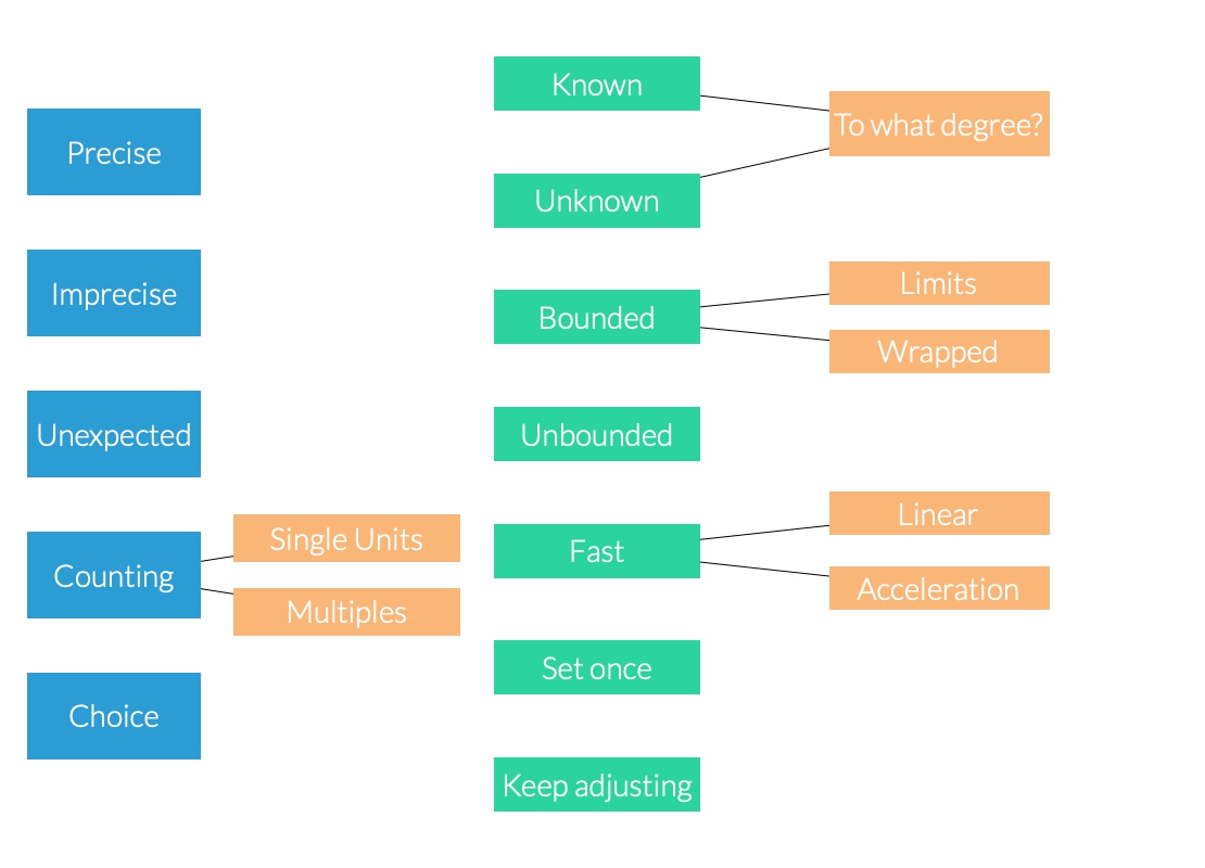
Adding variations
A problem with this was that it started to feel circular. If we have a precise number intention that is unknown, bounded, and has hard limits, is it not just a choice?

The snake starts to eat its tail.
Changing intentions
Another problem with this approach was that intentions don’t necessarily stay the same. Anyone who has used graphic design software will know the feeling of using a tool to quickly move something to a position that is almost right, and then spend ages wrestling with the resolution of their mouse/trackpad and current level of zoom while trying to to 760px instead of 759px or 761px. The problem was that the user’s intention changed, while the interface did not.

Visualising changing intentions
A mess
The taxonomy started to become a mess. I started to wonder if I was just bad at taxonomies, or if a taxonomy was a bad idea in the first place.
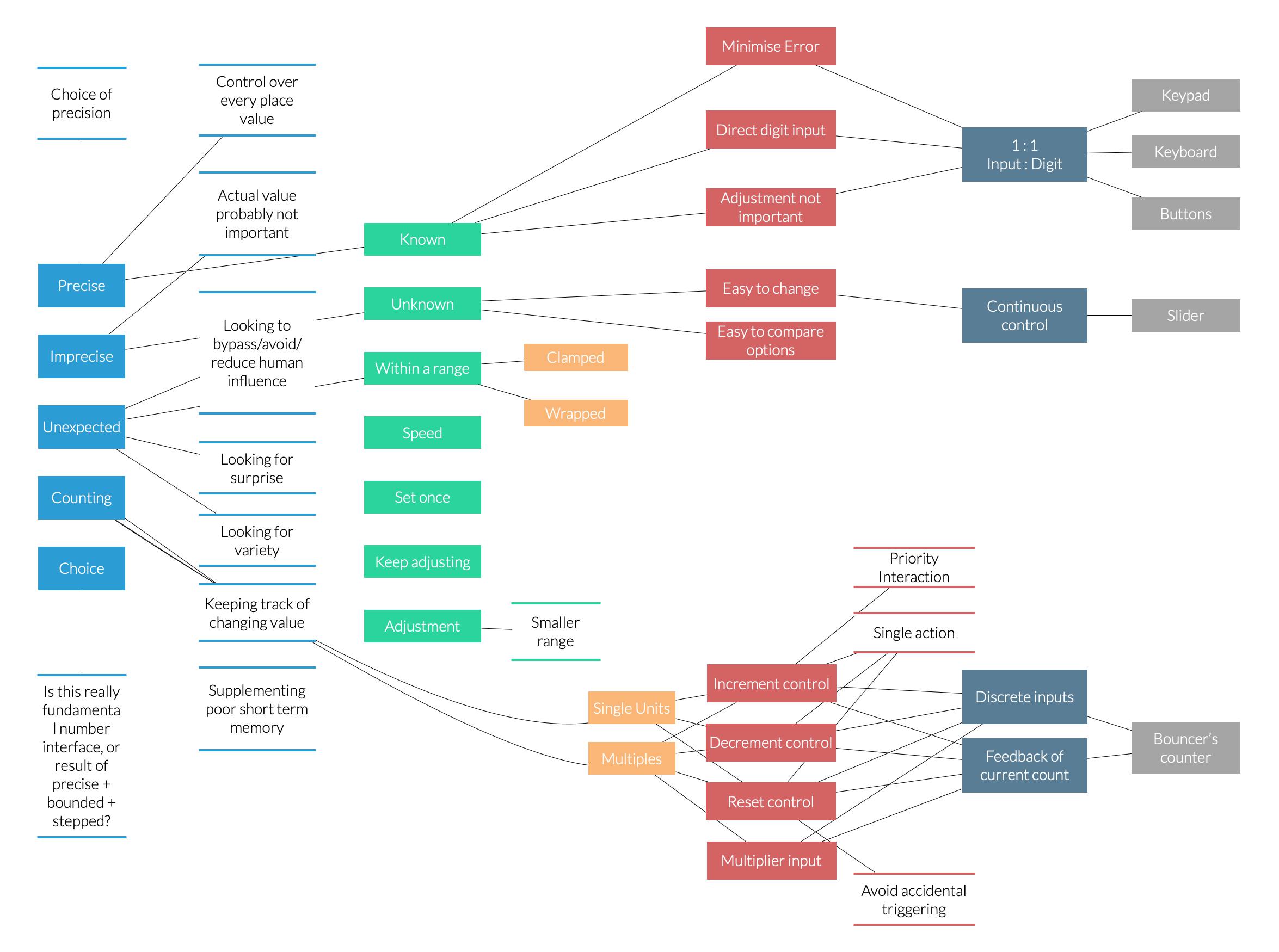
A big mess of a taxonomy
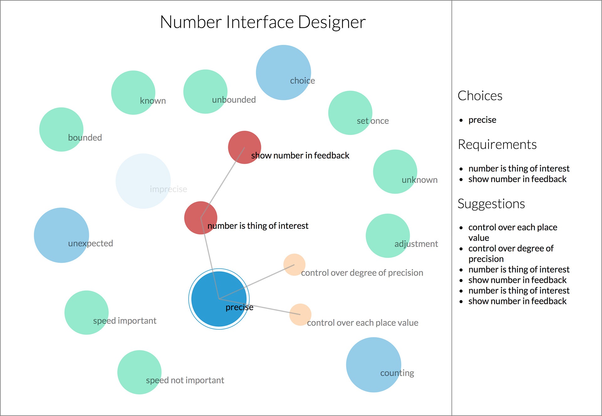
Design Tool
Instead I started work on an interface for designers to use to provide guidance and help make decisions when designing number interfaces, starting with the user’s intentions.
RCA Show
For the final graduation show at the Royal College of Art, I set up a large screen and two iPhone terminals. The terminals could be used to browse the projects and play with interactive demos, which were mirrored on the large screen so that passers by could see what was going on.
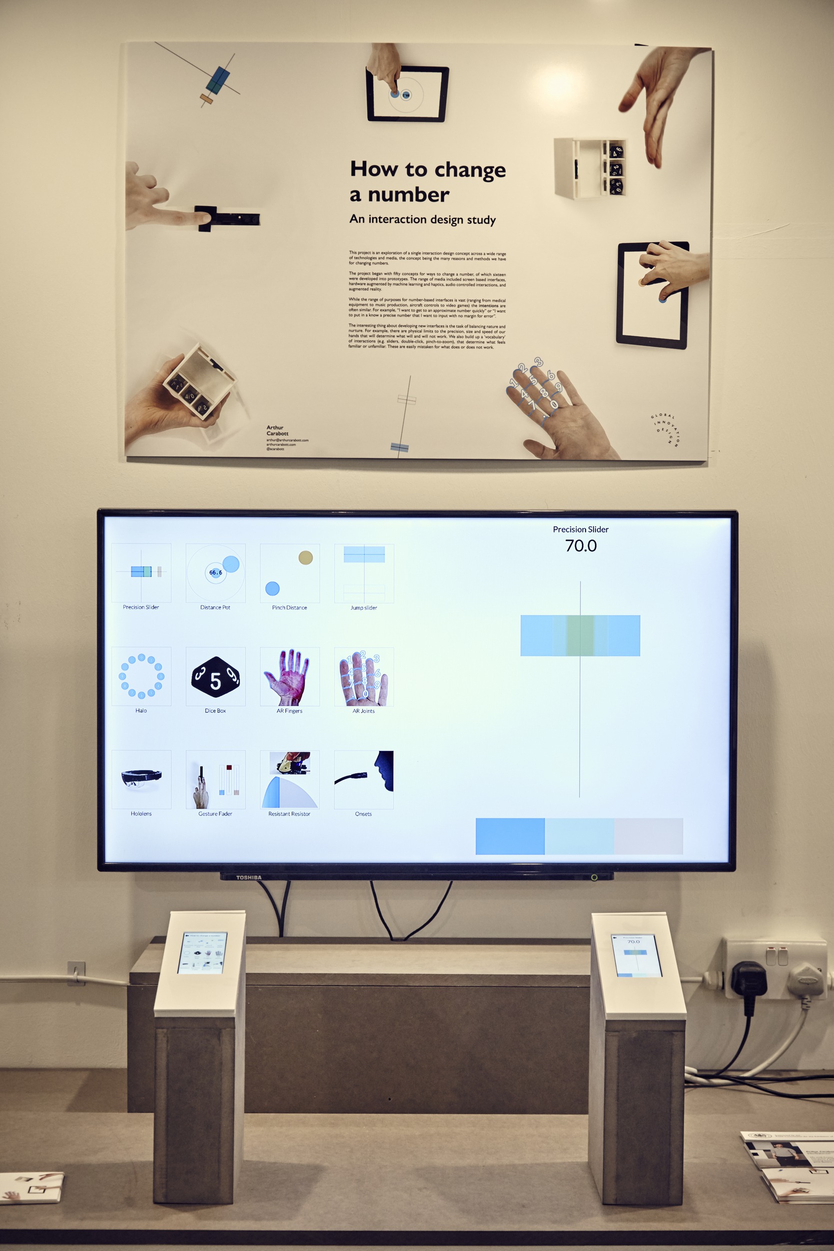
Large screen with two iPhone terminals
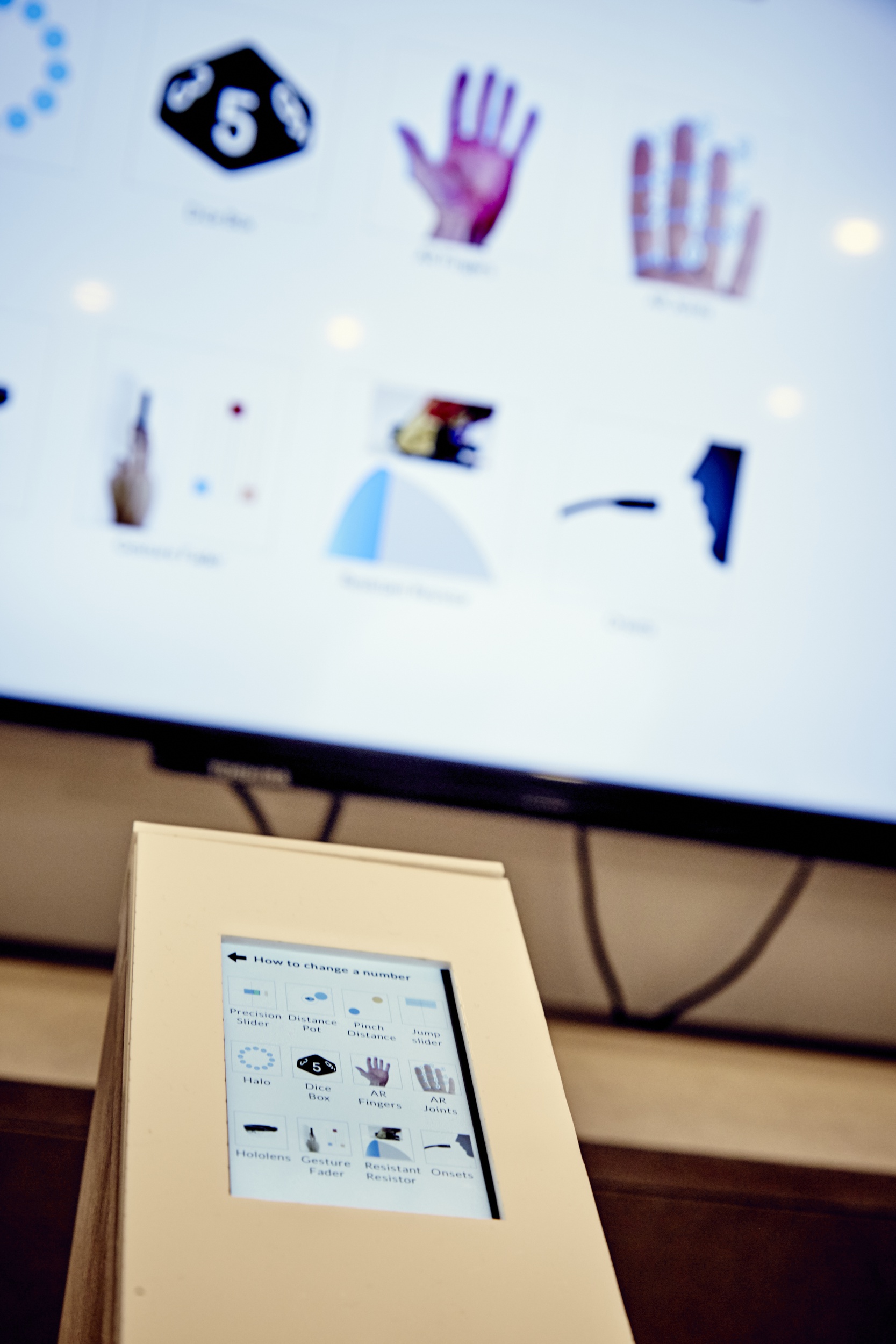
Browsing the projects on an iPhone
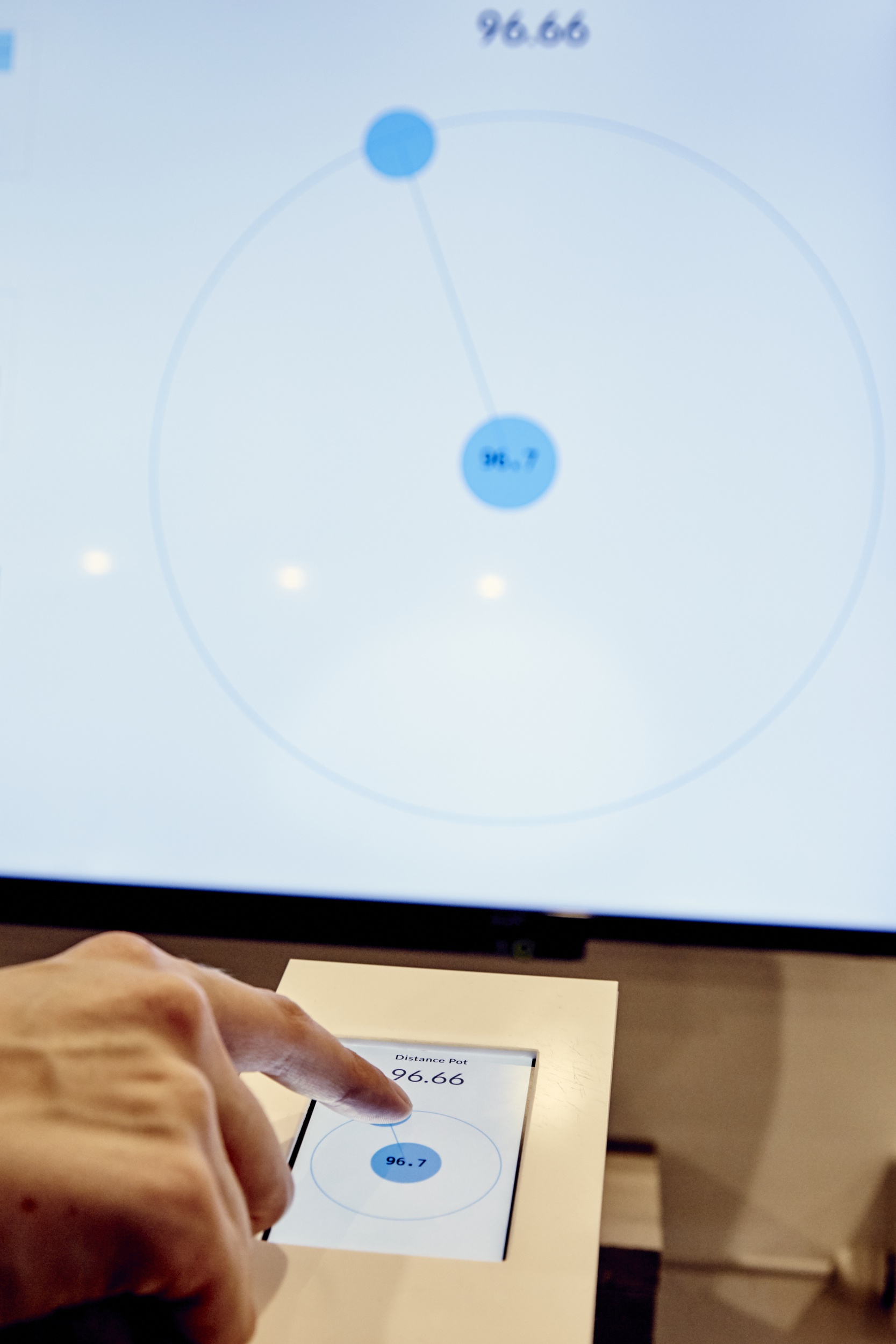
Playing with an interface on an iPhone
